On Netflix “View Instantly” one can watch one of their patented atypical documentaries about the font Helvetica.
One might think that a documentary about a font wouldn’t have much legs, but it held my attention throughout. Whenever you have some people only half-jokingly blaming Helvetica for both the Vietnam and Iraqi wars, and others praising the font as one of the best forums for spreading equality and democracy everywhere, and you have a good subject for a documentary. You will likely not see the world quite in the same way after viewing this film.
I don’t like Helvetica, but can appreciate its effectiveness. In extended text, Helvetica leaves me cold, or perhaps more accurately, leaves me standing still. I don’t feel any sense of life or motion in Helvetica. Reading a paragraph in Helvetica can be exhausting. But one can understand why it has such wide usage for signs and advertisements. I find that it does have the effect of rooting someone to the ground, making them stand still, and read.
I gained a further appreciation for Helvetica by realizing that even fonts have a historical context, as this clip from film makes clear:
To learn about Helvetica is also to understand the debate surrounding Apple as well. Helvetica, with its minimalism, modernism, and “accessibility” conveys the exact “brand” Apple seeks. Apple products are simple, easy to use, and designed with a minimalist aesthetic, just like Helvetica. So it makes perfect sense that Helvetica would be the default for their “Pages” program. But Helvetica has no motion in it. And like Apple, one could describe the font as a “closed,” or “immobile” system. What would Lewis Mumford think of Helvetica?
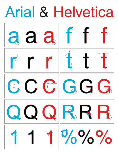
In another example of how art imitates life, Microsoft developed the font “Arial” to compete with Helvetica, with almost every graphic designer agreeing that Arial cannot hold a candle to Helvetica. This diagram may not show that very effectively, but look at the difference, for example, on the capital “Q’s” (the stem is too long in Arial) and the capital “R’s” (Arial’s “R” looks awkward and stiff).
All in all, there is certainly more to fonts than we might suppose. They work their white/black magic upon us without us really being aware of exactly how its done.
